Full Company Rebrand + Website Design.
Purpose:
With a growing desire to move into consulting and deepen her work in healing and transformation, Ana needed a digital platform that reflected the next evolution of her business. Formerly known for strength-based mindfulness training, she was shifting into a multidimensional offering rooted in shamanism, tantra, sacred healing, and energy work. The website needed to establish credibility, clarify her services, and act as a central hub for client engagement. Primary goals included lead generation, aligned brand presence, and clear service pathways.
Design Brief:
This project began with a complete brand realignment, supporting Ana’s transition from a strength-based mindfulness coaching business to a spiritually integrative practice rooted in shamanism, tantra, and energy healing. While the project started with logo development and culminated in a successful social media relaunch, the majority of time was spent designing and building a new website that truly embodied her evolving vision.
The logo process was deeply intentional. Ana provided three core colors—Ocean Blue, Flame Orange, and a Gold Gradient—from a “Soul Color Reading” and requested a shift from her previous bird motif to a dragon, a powerful symbol of mastery, transformation, and spiritual guidance in shamanic practice. The final logo features two dragons forming an infinity shape, representing sacred balance and alchemical healing.
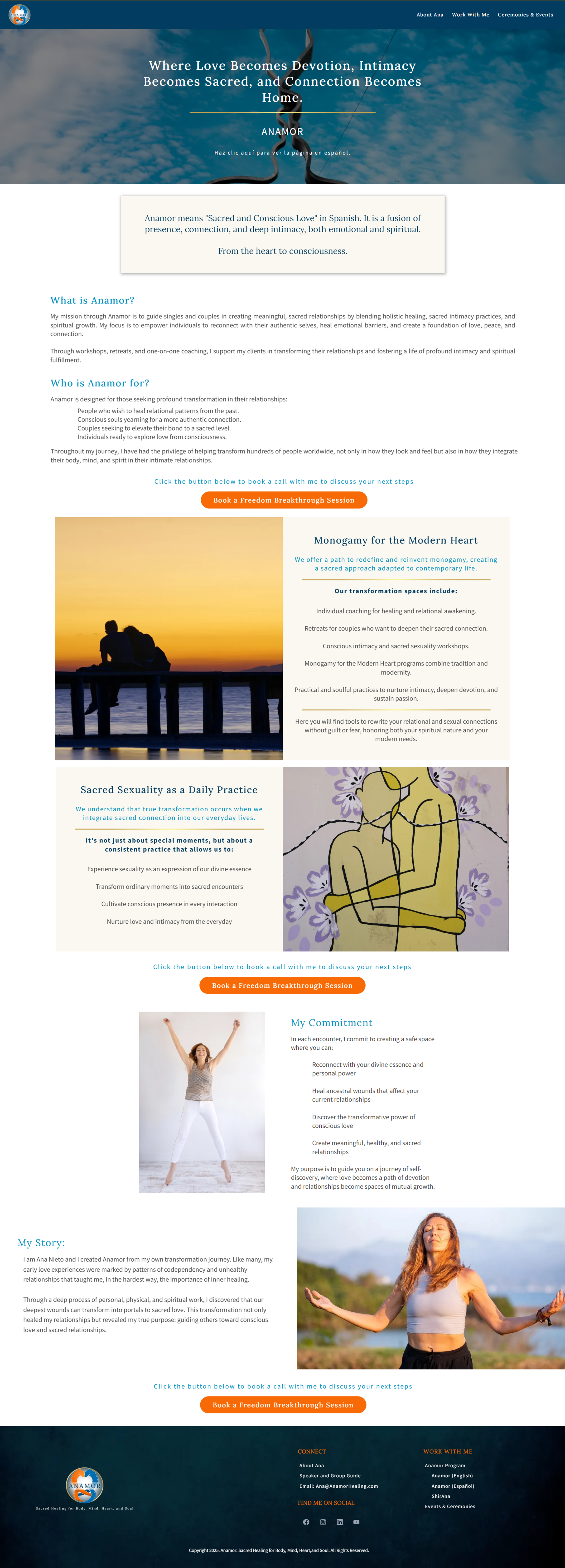
The website was designed to feel like a sacred space: calm, intuitive, and energetically aligned with Ana’s work. I expanded the brand’s color palette for depth and dimension, and carefully structured each page for clarity, ease of navigation, and a ceremonial tone that mirrors Ana’s presence and offerings.
The site architecture helps users naturally move between Ana’s story, programs, events, and speaking engagements, while embedded lead capture opportunities and consistent visual rhythm support both functionality and flow.
Platform & Tools Used:
Website designed in Actionera
Tools: Adobe Photoshop, Canva, Acrylic Painting
Branding elements were created using Adobe Photoshop and Painting
Key Features & Design Solutions:
Custom Brand Identity: Logo, color palette, and typography designed to reflect both ancient wisdom and modern professionalism
Service-Based Navigation: Clear organization of programs, events, ceremonies, and speaker offerings
Integrated Visual Symbolism: Sacred geometry and elemental motifs represent flow, presence, and transformation
Tone & Messaging Alignment: Weekly email templates, social captions, and calls-to-action were rewritten to match the new sacred, intuitive voice
Multi-Platform Brand Presence: LinkedIn, Instagram, Facebook, YouTube, Acuity, Zoom, and email platforms were updated for consistency
Resource Integration: Event flier templates and a speaker one-sheet were designed to support visibility and client outreach
Outcome & Client Impact:
Since launching Anamor, Ana has experienced a noticeable increase in client engagement and visibility. The brand’s transformation drew immediate reinterest from former clients, attracted new ones, and led to a high-profile speaking opportunity in New York shortly after launch. The three-part social media rollout received enthusiastic feedback, confirming the new brand’s resonance.
The full brand system—website, visual identity, tone, and materials—has become a foundation for Ana’s next phase of expansion as a spiritual consultant, guide, and speaker.
Brand Guidelines One-Sheet
Brand Guidelines Full Presentation
Business Cards

Logo Final Selection and Proposals

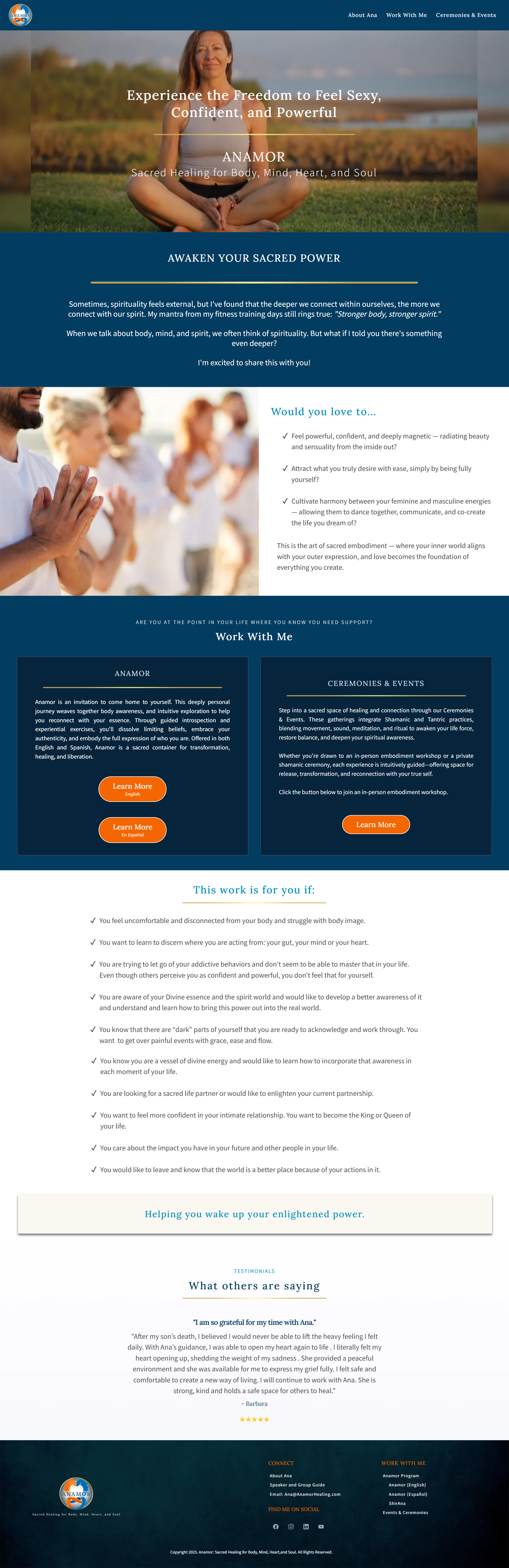
Home Page

About Page
Program Sales Page
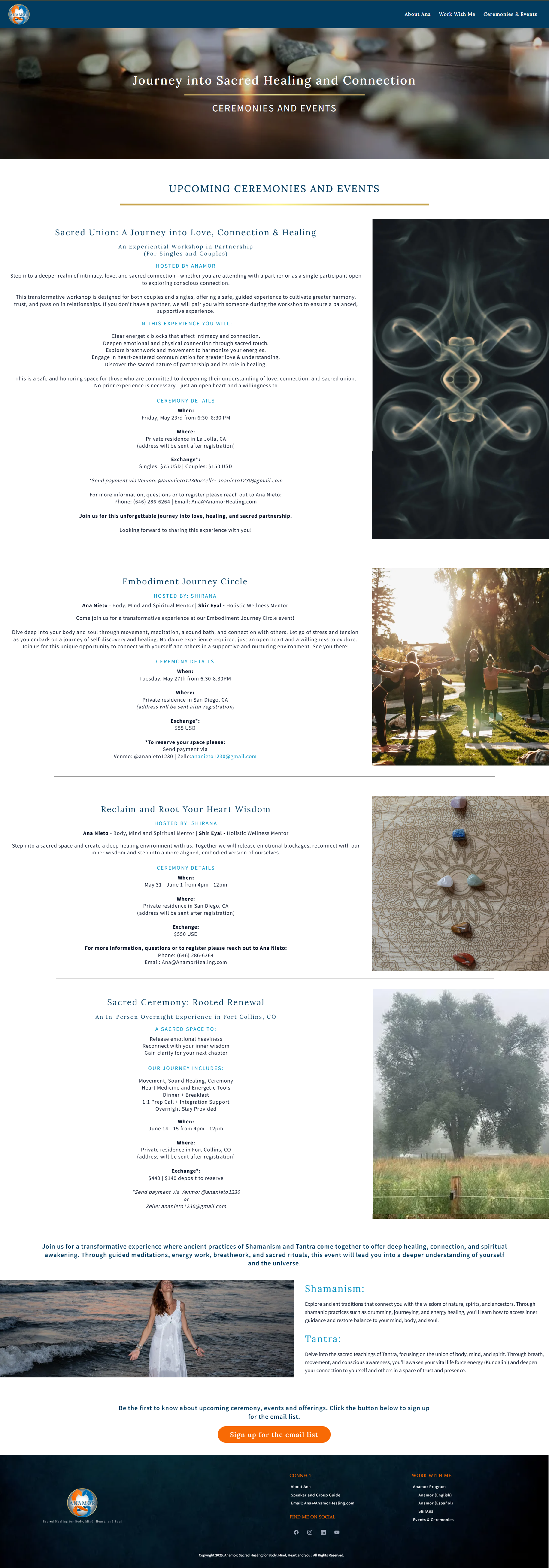
Events & Ceremonies Page
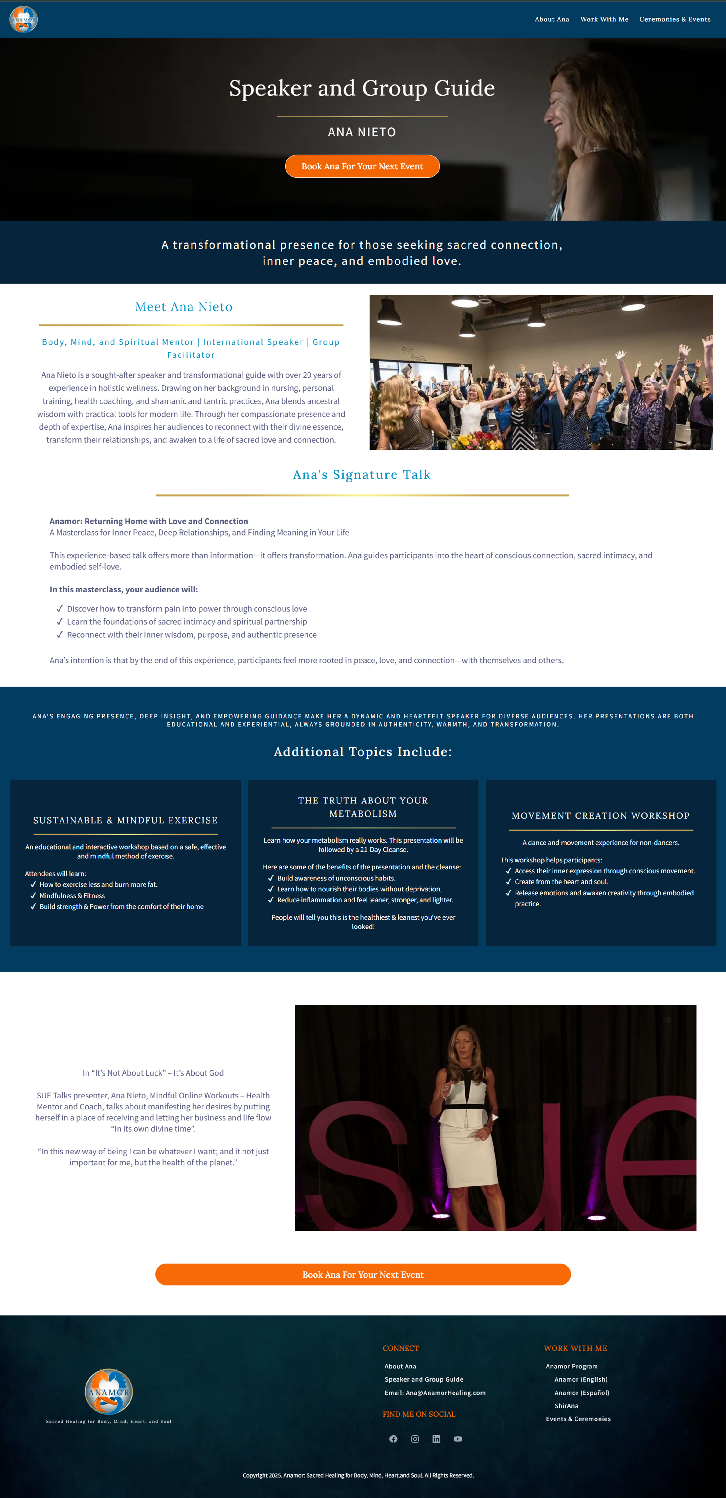
Speaker Page
Co- Facilitated Branch